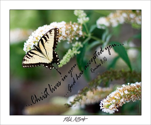
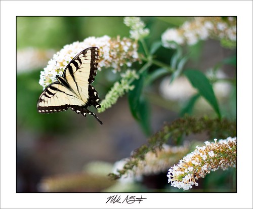
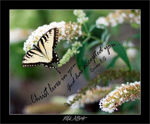
UPDATE... Ok, a friend didn't like the photos (I like honesty)... but, it wasn't so much she didn't like the photos, she didn't like the "white on white" look (white flower and white frame). So... I changed the frame color to black... and the reaction was COMPLETELY different. And... it was for me, too. Sooo... which one do you like best NOW?
I also have to add... my friend made the comment, "The butterfly has a piece missing from it's wing." My response... "Yep... imperfect... just like us. Broken, tattered and torn." She responded, "Broken, tattered and torn, but still loved, accepted, forgiven and considered perfect in HIS eyes." BINGO!!! God is awesome!!! :-)


2 comments:
I like the Black border, but I want the lettering, "Broken, tattered and torn, but still loved, accepted, forgiven and considered perfect in HIS eyes." in the same font and the same path. Matte finish in a nice frame.....I'll pick it up soon. :-)
I didn't notice the small imperfection until it was pointed out. Now I can't stop staring at it. It makes me feel like the butterfly is me. I can't stop staring at my small imperfections. It's a swirling vortex. Does the butterfly even know it is missing part of the back of it's wing? Does he care? Does it affect the way he flies?
Nice photo! Nice job on the text too.
DaveO
Black is much better
Post a Comment